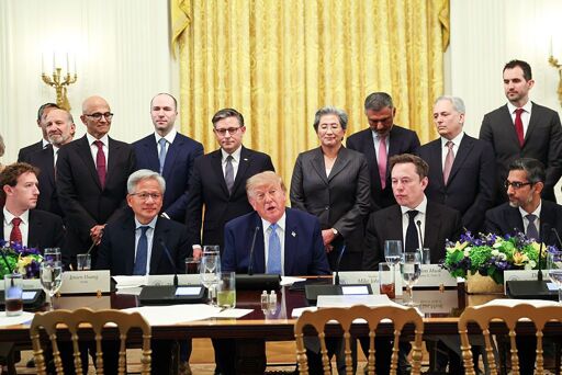
On Tuesday, President Donald Trump and top AI leaders announced a signed pledge called a “Joint Commitment on Frontier Responsibilities” — a voluntary promise to implement more controls and safety measures as the rapid development of artificial intelligence continues. But there seems to be a catch.



It’s a cursive Z. Don’t ask me why it looks like that, cursive is weird and shouldn’t be used anymore.
Yea but what is after the z and the m looks like it was written at gunpoint.
Signatures very rarely preserve the actual letter shapes.
All signatures look bad, you just try to make one consistently. Of all of the ones shown, I think Jensen has the best looking signature, but none of them are legible enough for anyone to actually read and understand who was supposed to be signing.