“kiss me, I’m so pretty”
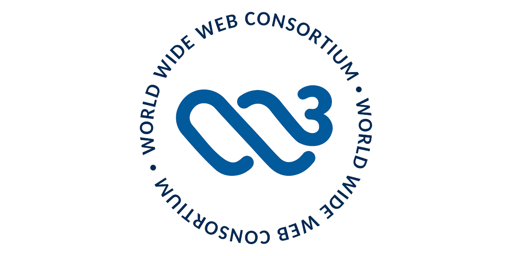
I preferred the old one. Think it was clearer what it referred to for people not familiar with the logo.

deleted by creator
I agree, though Nike would not
I disagree that the new one is too abstract. The w³ part is pretty pronounced, and then there’s design elements that reminds me of surfing.
[This comment has been deleted by an automated system]
I guess human perception is very subjective. To me the W3 is very obvious, but I have a hard time seeing a penis.
i can definitely see the 3 and also have a hard time seeing a penis, but whether i’ll see the w depends on the time of day
I like the old one because I like the W3C, but when you see it you do get the impression that they were important in 1995 and probably haven’t done anything since.
I’m with you. I don’t love the new one, but it’s an improvement.
this is slightly vertically overstretched
actual logo: https://commons.wikimedia.org/wiki/File:W3C®_Icon.svg

Double the TIL: W3C’s in charge of the ActivityPub standard
Looks like a hanging nut-sack if you turn your head.

Looks like a penis looking back for a butt picture.
a hanging sack and a cork screw penis!
nah that’s a seahorse mermaid seathing
Corkscrew penis
You see what you ‘want’ to see. =)
This comment sections is one of the weirder moments I’ve seen on Lemmy.
Experts in web technologies, but evidently not in graphic design.
looks like shit. i mean literally
Hahahahahah a turd with a fly landing on it
“Not every change is a change for the better” is especially valid in the logo design area.
And: Don’t they have real problems where they could have spent time and effort on instead?

I like this one. Positive change in my opinion. :)
<3
I’m reminded of laundry detergent for some reason.
All I can see is two wailords humping eachother. Love is in the air.
Reminds me of an old Warner bros logo
The consortium clearly has too much money.


